Found a video of a company that helps companies build their exhibition booth. quite interesting marketing. to be honest, i never really payed attention to these kind of videos before till i was given a project on creating a exhibition booth. Now i roughly get the idea of the feeling of actually creating one. It's definitely not easy but it's heck of a challenge that ends up satisfying.
Thursday, January 19, 2012
Wednesday, January 18, 2012
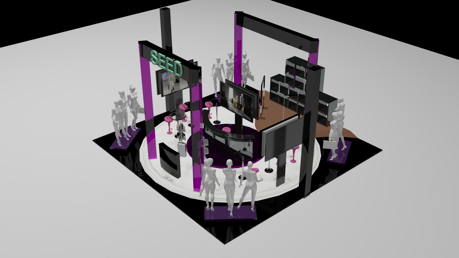
Completion of Exhibition booth design
After completing designing and rendering that felt like it took ages! fadh and i managed to complete our 3D model booth. what a satisfying feeling!
Artist Impression

Perspective View
Front View

Side View

Top View

Everyting looks great and has been submitted. Now it's time to party!
Thursday, January 12, 2012
Environment Design (designing)
Here's a good tutorial to give a brief idea on how the modeling should be done and look like.
Cool things that are in Environmental design.
Wednesday, January 11, 2012
Artists Impression (Video)
A good example on artist Impression. the video gives u a brief idea on how it shoud look like. posted in this blog because i think it's sort of usefull as it does relate to Environmental design.
Tuesday, January 10, 2012
What exactly is an Artist Impression?

An artist's impression is an artist attempt to present a picture of something, someone or any phenomena that issn't the exact image but is actually an approximate representation or an imitation. a good example of this is when architects draft out their idea/ plan onto paper before actually going to the building or constructing progress/phase. their mainly sketches that brings the whole visualization of the project clearer.
Here are a few example of Artist Impression :


Sketches made with illustrator i believe. after the sketches has been made the next procedure is to transfer it to an illustrator programe to move on and line everything neatly with appropriate measurements/scale and color.


The two picture above shows a good example of skethes made seriously to give the client a good idea on how things are gonna look like with good positioning and decoration.

Here's a finalized artist impression that i think looks amazing.
Sunday, January 8, 2012
Bright Colors
Was browsing through unique building designs on Google when my eye got caught up with these pictures. I'm just fascinated with the way how they include the glowing colors in their design which definitely works! no doubt!
 Color tinted mirrors being use to give this outstanding efect.
 glowing cubes looks really sexy indeed. haha but being serious it looks definitely attracting and it obviously works for it's purpose.
blue is the color here which sort of give an icy feeling towards it.
Thursday, January 5, 2012
LESS IS MORE and MORE IS LESS
When more is less and less is more

When less is more.
Less is more can be best described to be various forms of art and design that for example is created whith a lot of effort that can be visuably seen hence making the design heavy. That is when the term less is more comes kicking in when a subject is carefully planed out to reduce the unnecessary elements leaving only the important bit that are necessary. It’s used widely in visual art music and architecture which are main forms of art that has a reason for this term which is ‘less is more and more is less’.
When more is less.
I think what best describes this opposite term from less is more are websites. Good websites give u the most with the simplest and easy to access solutions. For example a website could have bare things on it like video clips or music players and can be a bit of a hassle when they all are being loaded. But that is just an example of a bad website, a good one would obviously just give u thumbnails and give u the right to click whatever u want. This is when the term more is less relates I believe, when more thumbnails are given for easy access it decreases the level of making the website horrible and this can also relate to art works on their layout and elements used.
Monday, January 2, 2012
Wayfinding and signage

Sign is mostly referred as the 'wayfinding' which is designed to direct people within a distinct area, guiding them along certain paths providing instructions all the way and mark destination. we normally see them indoors and outdoors for public usage where normally first time goers will definitely go for some assistance.


Signs are tools that help alot in wayfinding for example architectural indicator such as light, color, materials and pathways also play a large role in wayfinding. A successful wayfinding program is self navigable and it protects overall visual of the certain area. wayfinding is specific to its place and their visitors.


Subscribe to:
Posts (Atom)