Thursday, December 29, 2011

Wednesday, December 28, 2011

Le Modular (Part 1)

After going through some research and doing some own readings on the topic given 'Le Modular' i've gained some valuable knowledge on the existence of The modular. here's my interpretation of the Le Modular based on what I've read.

Le Modular


Le Modular is the special given name to a Swiss-born French architect Le Corbusier. The Modular is recognized to be an anthropometric scale of proportions which he related to Leonardo da Vinci’s “Vitruvian Man” that later used by architecture to help scale the proportions of the human body to hel[ improve the appearance and the scale of a certain element. Examples couls be like the width and height of a door or the size of a chair or table and even the height of the ceiling. After Le Corbusier sought to introduce a scale of visual measures while being fascinated still with measurements such as an elbow equals to cubit, fingers used for digits and a thumb for inch measuring he was still baffled with measuring metres hence lead to the creation of The Modular in 1943.

It was created as an illustration bridge among two unsuited scales which are the Imperial system and the Metric System and based on the height of an English man with his arm raised.

Le Corbusier quoted the Modular to be a "range of harmonious measurements to suit the human scale, universally applicable to architecture and to mechanical things."

Phase 1 - Exhibition booth design

After designing and redesigning the sketches for the exhibition booth, both me and my group member Fadhli came to a conclusion on how out booth will eventually look like. a lot of thought have been put to the design in the positioning of elements such as the information desk, reception, interaction desk, brochure shelf, LCD television and product display area.

Here's a bit of insight on our plan which was done in Adobe Illustrator.


After seeing our lecturer Mr. Zul for consultation of our exhibition design plan. he has agreed to give way for us to continue to the 2nd phase which is creating the model exhibition in 3D.

Monday, December 26, 2011

Exhibition Profile


We've selected to have an Information Counter, a Reception Counter. an Interaction Area with Plasma TV , mannequins and a product display area for our SEED products. Down here is our finalised Exhibition Profile.


All those elements were measured our particularly to fit our floor design and everything was arranged accordingly to make the place work as a exhibition booth.


The Floor Plan of the booth's layout and the positioning of the elements:


Sunday, December 25, 2011

The Ideation of Seed Exhibition Booth

Our Concept Board

Ok here's a bit what fadh and i planned on how to designed our both.

first of all the product that were going to advertise is Seed. Seed is known for their stylish cloth-line and what can perfectly fit the picture? exactly! a fashion runway. We're bringing all of u a seed Fashion Runway guys! except there's not gonna be any models doing the fashion show, infact there isnt gonna be a Dj or what so ever and sadly there isn't gonna be an actual runway. -killed it-

we're just gonna use the concept of a fashion runway and apply it to our booth. so the good news is that there will be a runway floor let me rephrase that, there's gonna be a floor that looks like its from a runway just a bit smaller and a bit circular and we will try our best to make the atmosphere of a runway show present in designing the booth.

down here is out concept board that consist all those fashion runway elements:

We've got Seed Posters, We've got stunning mannequins, we've got the polished white floors and we've got everything it takes to make our idea happen. keep up to date on how the design goes!

Saturday, December 24, 2011

Final Floor plan sketch


After goin through quite a hassle finding the accurate shape we wanted here's the final skecth that we agreed to be perfect!


Final Sketch #3


Now we are ready to tranfer this floor layout sketch to AI to do further editing... getting excited?

Friday, December 23, 2011

Floor Plan Sketches


Me and Fad had a tough time trying to get the perfect floor plan when suddenly the base of an ash tray came in handy and gave us the basic shape that we needed. then we started brainstorming the elements and placing them to places that seem appropriate.

Sketch 1,2


Thursday, December 22, 2011

Root Top (booth)


In this blog entry i'm gonna be focusing a bit on the roof design on the exhibition boot. just looking for some inspiration for my SEED both. Whether it's necessary or not to have a roof will depend on further research and another trial and error in placing the roof.


i believe the ideation of the booth is to give a futuristic feeling to the mass hence giving it a out-standing look towards the roof of the booth. (rooth booth rimes yo! ) a smooth designed roof with a bit of soft curves in it gives a calm yet soothing feeling to it.


The design of the roof here is a bit unusual as it sort of look like a fan an gives an Asian touch/feel towards it. But it still looks modern yet unique.


This bulky roof looks great but i dont think with the runway theme towards my booth that it will look suitable.


The Floating box roof looks cool! something to look into more...


ok these two roof top for their exhibition booth look really common and abit boring but hey i might just work with the right set of design and theme but i don't think i will for my booth!

Tuesday, December 20, 2011

Runway Stages


As i mentioned before that me and my group partner Fadh will try to pull off a exhibition booth that looks similar to a runway stage. here are a few good examples of stages that elements might just suite the layout of our booth.

talking with common sense our booth will definitely not fit a whole runway stage even a rectangular shape might even consume a lot of room.


The layout design of the stage looks great but unfortunately it doesn't look appropriate for the booth.

The circular theme kinda fits the profile here.. not a lot of space is taken and there's still room to move around.


This design looks perfect! using just a small amount of space to emphasize it's a runway stage is just what our SEED booth needs!

Thursday, December 8, 2011

Exhibition Booth Design


Thought that branding a bust stop was thrilling, think again... Now we are assign to create an exhibition booth which is way cooler.. Well i'm exaggerating making it all sound good, its actually a bit harder as it has a lot of elements that need particular attention in creation process.. But nothing is impossible!

Why do we have to design a exhibition booth? It is because..........................
an exhibition booth happens to be a great choice for branding and marketing departments of a company as it showcases products in sense to create awareness and attract the mass. We've definately seen exhibition booths either small or big at shoping outlets, exhibition halls or events..We even have some in our beloved university MMU.

To get everything goin here's some cool exhibition booth design which i think are good inspiration in getting the idea of creation and design.


Where's my pen and sketchbook i need to start skecthing!

Wednesday, December 7, 2011

From London to SEED


To move on to the next assignment we had to choose a partner to from a group that consists of two people. So i decided to team up with Fadh to continue our journey together in this wonderful life of assignments given by Mr. Zul.

We had to select either my brand name London Biscuits or Fad's brand name Seed. We made a lot of thinking and decided that it would be much intriguing to create a Seed booth resulting that i had a lot of ideas that i can put in the SEED booth.

So let me now put aside London biscuits and say hello to SEED!


I am quite intrigue with the fashion style that seed brings and i'm quite intrested in the whole fashion and models theme. Seed Exhibition Booth here we come!

Tuesday, December 6, 2011

Bus Stop Model Completed!

My Bus stop is finally done and has already been submitted!!!! a feeling of relief!!
due to the excited feeling of finishin the bus stop model i forgot to take pictures of it.. luckily there was someone kind enough to take a photo of my bus stop. :)


My creation of London Biscuits Bus Stop

Credits to Izyan Syairah for taking this photo! :)

Saturday, November 12, 2011

FORM FOLLOWS FUNCTION and FUNCTION FOLLOWS FORM


By reading through related articles on the topic I found that basically for a design to work, a person either use form or use function as their guiding design principles it goes both directions.

An example that I could think of is that for instance a glass is designed to be able of holding walter hence the form of the glass reflects the function of the liquid.

A problem discovered by a person named Curt Cloninger was that he found that when ‘form follows function’ it is as stating that every form that naturally exists in our world is present because of functional requirements. For example going backwards we start with the end result then we turn back to the origin of it and assume that the results were predictable. But there are actually reasons why something might have a particular form.

I believe the debate of this still goes on as most articles I read has their own saying for everything but if I was asked this question whether FORM FOLLOWS FUNCTION or FUNCTION FOLLOWS FORM that im actually am being ask now which is why im writing this, I would most probably say that Function Follows Form. This is because I believe that one u are researching on one’s function particularly, a perfect idea of getting the form in comes directly next.

Wednesday, November 2, 2011

The Bus Stop That Sneezes


Was going through some bus stop design research when suddenly i tumbled upon this hillarious yet innovative video of a bus stop that was designed to sneeze.


Just felt like sharing this video. maybe it could help you in the creation of your bus stop? Who knows...


Sunday, October 30, 2011

Branding a Bus-stop

First of all branding a bus-stop sounds extremely COOL! first of all like usual we had to do some precedent research on existing bus stop then after that comes the cool part which is we had to make a live model out of it.

just to make things clear, a bus stop happens to be a popular place for advertisers as everyone on earth uses it or if they aren't using the bus stop for waiting purposes their either walking pass it or even just staring at it for eye comfort purposes! This is actually the reason we were assign to design one intriguing bus stop with advertising that works and not only just to make the bus stop look fabulous.

Here's a few examples of what i'm getting my self into :


Look at the way they made the layout of it. i reckon that the poster is made to give an symbole of fatness.


I believe here the designer is trying to emphasize that Toshiba's product makes u feel like you are actually there experiencing it live.


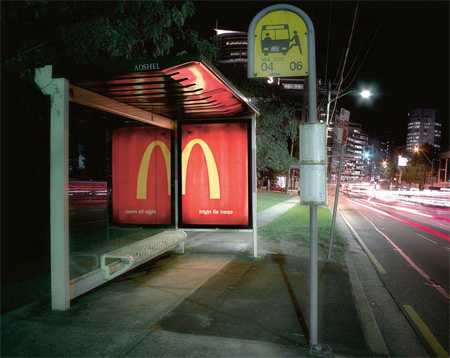
This bus stop looks just way too cool.


love how they use the illusion from the reflecting mirror to reveal the mcdonald sign.. Creative indeed!

ok looking at all these cool examples i can't wait to start the project.

Friday, October 28, 2011

Choosing a Company Name


We were ask to choose a company that we would later use for advertising purposes. after doing a lot of thinking i thought of choosing a brand that known for the biscuits they make. i just felt intrigue to promote/advertise this brand as i haven't really seen London Biscuits Sdn. Bhd. being properly advertised. soooo i started googling here and there to find appropriate information and pictures on the brand which can be useful.


London Biscuits Sdn. Bhd.


Here are some of the products that London Biscuits brings to us :


Information Kiosk


The information Kiosk here is designed really simple. They put all the information including the site map on a one piece rectangular layout. It's very common and a bit cliche and it's definately easy to understand.

Thursday, October 27, 2011

INFORMATION COUNTER AND INFORMATION KIOSK


The class was assigned to go out and take photos of an information center. Without any hesitation i brought out my cheap camera to The Curve Mutiara Damansara and started to take the photos. P.s. the workers in the information center were all trying to look natural..lol


Information Counter


-Trying to do a 360 degree shoot-


A simple design that consist of a circle/cylinder shape which colorful glowing box shaped texture which kinda makes the information center here standout a bit.